 Add Row
  Add
Add 

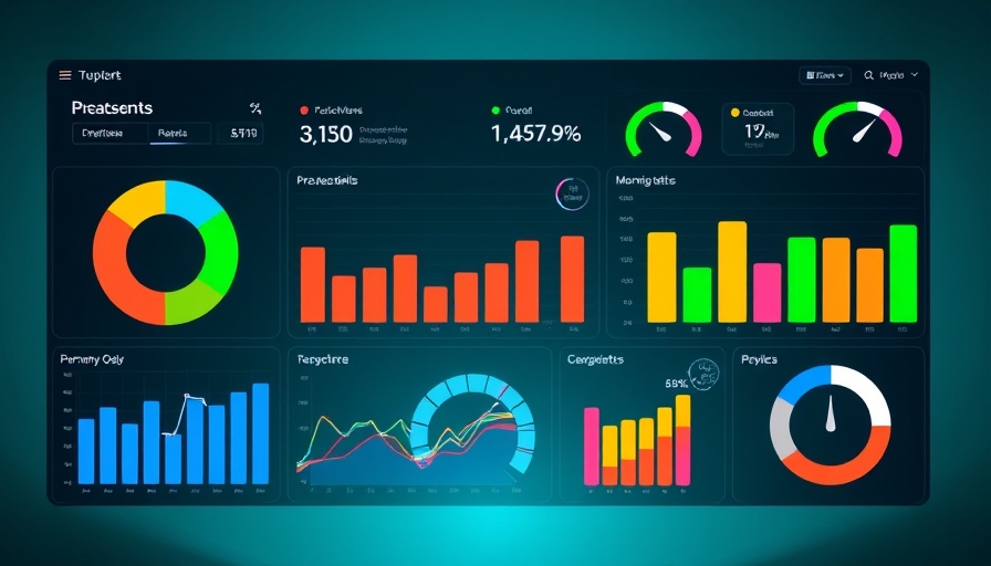
Mastering Pie Charts in Google Sheets: A Business Essential
In today's fast-paced business environment, clarity of data presentation can make or break strategic decision-making. For business owners with annual revenues between $2M and $10M, the ability to visualize data effectively—like using pie charts in Google Sheets—empowers operational excellence and enhances communication with stakeholders. This guide outlines six simple steps to create pie charts that can not only streamline presentations but also foster productive collaboration.
Step-by-Step Guide to Creating Pie Charts
Creating a pie chart in Google Sheets is straightforward and beneficial for illustrating data distributions effectively. Follow these steps to get started:
- Open Your Google Sheet: Start by accessing the Google Sheets document containing the data you wish to visualize.
- Select Your Data: Highlight the data you'd like to represent in the pie chart, ensuring your selections include the labels and values.
- Insert Chart: Navigate to the 'Insert' menu and select 'Chart.' This will automatically generate a default chart type.
- Choose Pie Chart: In the Chart Editor on the right, click on 'Chart Type' and select 'Pie Chart' to switch from the default chart option.
- Customize Your Chart: Utilize the customization options to adjust the colors, labels, and data range to ensure your chart is visually appealing and informative.
- Embed or Share: Once satisfied with your chart, use the 'Share' option to collaborate with team members or embed it into presentations.
With these steps, you can transform raw data into a visual masterpiece that communicates insights clearly and effectively.
Why Pie Charts Matter for Business Owners
For mid-sized business owners, pie charts serve as a tool for communicating complex data simply. They help in project management, product development, and understanding operational processes. When presenting to investors or team members, a well-crafted pie chart can break down data into digestible parts, illustrating points more convincingly than words alone.
Originality in Visualization: Best Practices
Creating pie charts presents an opportunity to showcase your unique insights within your industry. Avoid common misconceptions such as overwhelming your audience with too many slices; instead, stick to 3-5 segments to maintain clarity. Always label your slices clearly and consider color-blind friendly palettes to ensure accessibility.
Future Trends: Visual Presentation in Business
As businesses increasingly rely on data-driven decision-making, the demand for effective visualization techniques, such as pie charts, will continue to grow. Adopting these approaches not only helps in meeting stakeholder expectations but also enhances project management and team collaboration efforts.
In essence, mastering the art of creating pie charts can dramatically enhance how you convey information. Whether you’re scaling operations, seeking funding, or improving processes, effective data visualization can set your business apart. Let’s harness the power of Google Sheets to turn data into decisions!
To learn more tips and tools on enhancing your operational infrastructure, explore our resources on project management and workflows.


Write A Comment